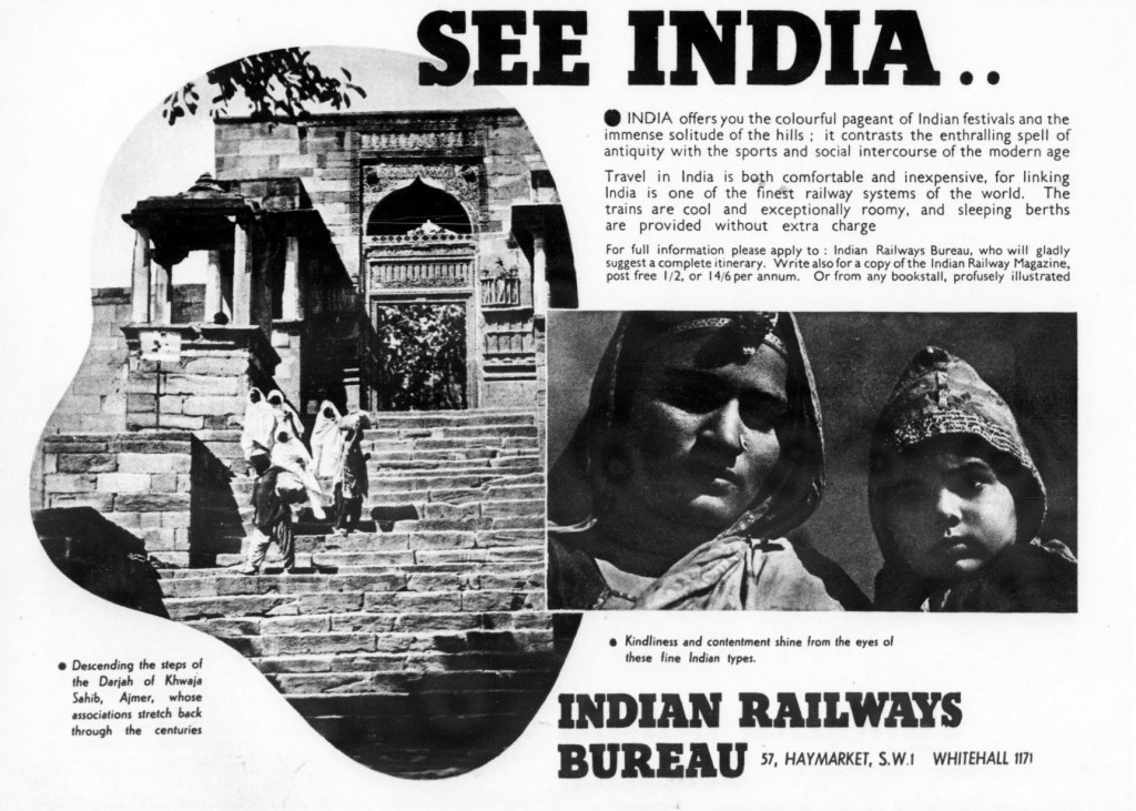
This advertisement, placed in the Illustrated London News on June 5, 1937, by the Indian Railways Bureau, is a polished little theatre of imperial reassurance. It invites the British reader to “SEE INDIA” not as a problem, but as a spectacle of romance, comfort, and managed wonder. The title is immense and blunt, almost poster-like, and it sits above a collage that arranges India into digestible scenes. One sees religion, landscape, social life, and the human face, all folded into a single commercial image. The effect is not accidental. It is the language of empire turned into a travelogue and made agreeable. India appears as vast, various, and yet somehow already curated for the visitor.
The left side dominates the composition with the great stone steps of the Dargah of Khwaja Sahib, Ajmer. The building is shown in strong black and white, with the staircase drawing the eye upward and inward. The ascent suggests both pilgrimage and discovery, sacred movement and tourist access. The caption tells us the associations “stretch back through the centuries,” which lends depth without demanding historical labour from the viewer. A few women in white veils stand and climb, their bodies reduced to elegant figures within a monumental setting. The shrine is not merely architectural here, but also atmospheric. It enfolds antiquity, texture, and devoutness, all neatly enclosed within a circular frame that feels almost like a porthole onto another world.
On the right, the advertisement shifts from monument to humanity. Two Indian women–a woman and a girl–are shown in close-up, their faces heavy with shadow, their clothing and head coverings catching light in a way that gives them almost sculptural dignity. The caption, a little stereotypical, speaks of “kindliness and contentment” shining from their eyes. It renders them as “types.” That phrasing tells us much about the imperial gaze. It looks for legibility, for moral types, for a reassuring emotional grammar. Yet it is not wholly ungenerous. The women are not mocked, nor turned into caricature. They are presented as serious presences, with a gravity that resists complete simplification. The image asks the reader to admire them, even while naming them through a foreign vocabulary.
Above these scenes, the copy promises that India offers “the colourful pageant of Indian festivals” and the “immense solitude of the hills.” That contrast is carefully chosen. It allows the country to be both crowded and contemplative, lively and remote, ancient and modern. Travel is described as “comfortable and inexpensive,” with trains “cool and exceptionally roomy,” and sleeping berths “without extra charge.” Here the advertisement does its most plainly commercial work. It reassures the British traveller that distance has been domesticated by imperial infrastructure. The railways are presented as not merely transportational. They are proof that empire has made the subcontinent traversable and knowable; even pleasant.
The design too deserves notice. The photographs are cropped into soft-edged geometric forms, creating a collage that feels modern, almost cinematic. The black-and-white contrasts are forceful, but the overall arrangement is airy, with generous white space around text and image. “Indian Railways Bureau” appears at the bottom like a seal of authority, while the London address, in Haymarket and Whitehall, quietly reminds the reader where power and publicity still reside. This is an advertisement for India, but also an advertisement of imperial confidence. It trades in exoticism, certainly, yet it does so with a tone of order, familiarity, and administrative calm. That is its deepest historical idiom. It shows empire not in the garb of conquest, but in the polished attire of a language that has conquered leisure.
Image Source: The Illustrated London News, June 5, 1937.
